Web Improvement

Frame By
Frame

Feedback

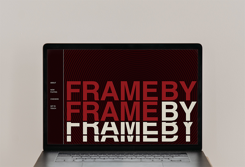
The feedback I received for this project was to give the website a purpose. Originally, the website had a few sections that did not have a function and overall lacked a purpose. I also received feedback on the typography and color scheme. The typography was uninterestinf and the color scheme was not cohesive. Another poiint was that the website was also not responsive and did not have a mobile version.

Outcome

I decided to combine my original cinema themed react site with a cinema zine I made in our publication class called Frame by Frame. I took the original idea of the site and combined it with the zine to create a more cohesive and interesting website. The color scheme and typography were meant to match the zine and bring it to life.
Print Improvement

Juice Box
Packaging

Feedback

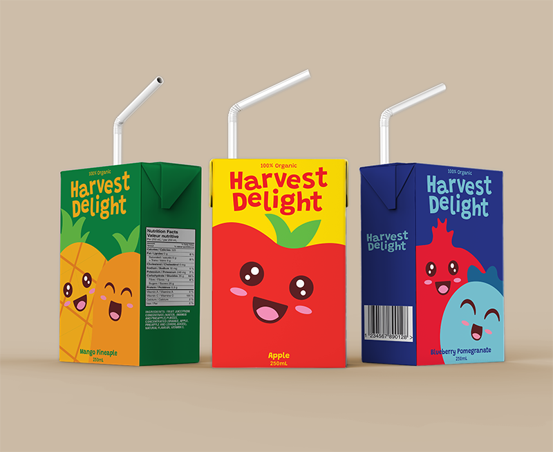
The feedback I received for the original design of the project was to improve the illustrations and visual hierarchy of the design. The Splash in the background and drop shadows and elaborate logo were all fighting against each other. The typography could be improved apon and the color scheme. The logo should either always have the same color or all be different to match the illustrations.

Outcome

I decided to simplify the design and turn the illustrations into a flat design. I also blew up the illustrated characters so that it will take up more space on the package. I updated the color scheme so that the logo will match the color of the illustrations.

Click on the before and after buttons to download a pdf copy of the designs.