Target Audience
While deeply personal, this project was also created with fellow creatives in mind.
Tools Used
InDesign
Photoshop
Client
Academic
Winter 2025
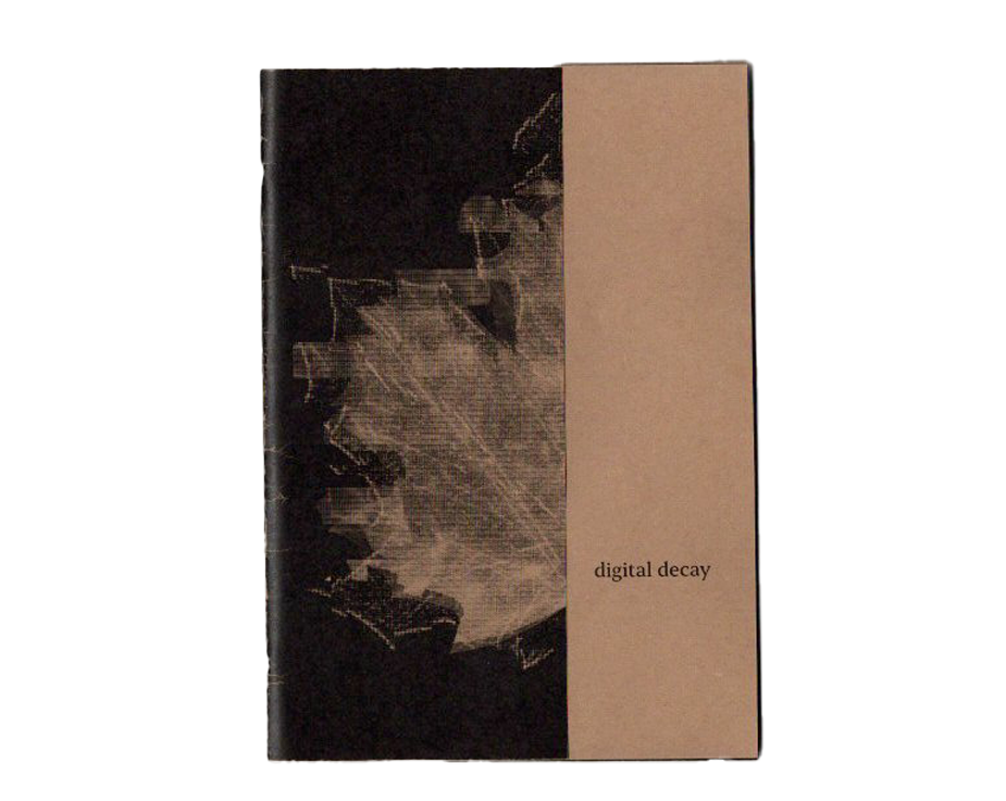
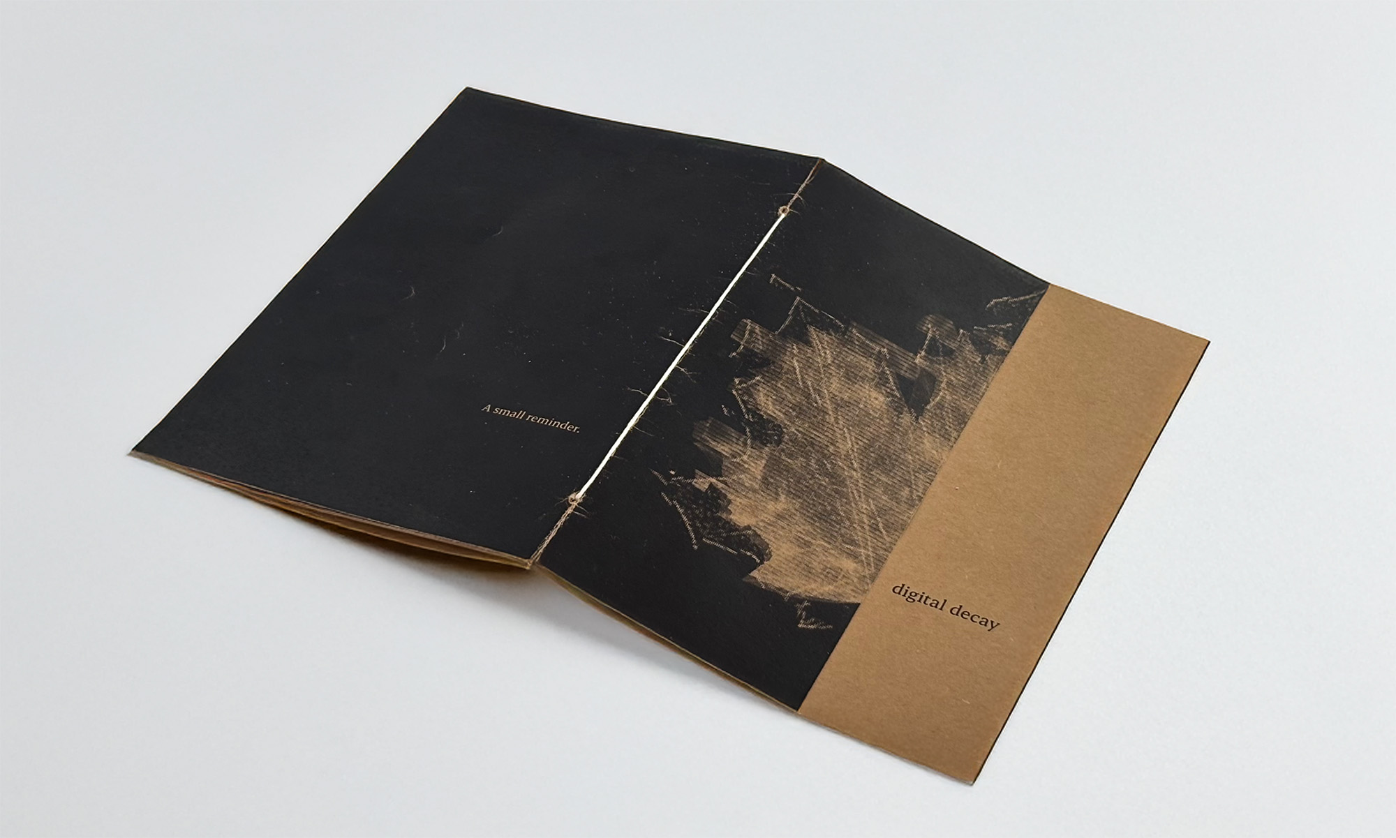
Digital Decay was a personal project created for a school assignment, where the objective was to explore our own creative process through a project in our unique design aesthetic. I chose to design a zine that reflects my interest in grungy, experimental design. The project became a visual reflection on our growing disconnection from nature and each other due to constant digital interaction. This project’s goal was to serve as a personal reminder to step away from the screen and reconnect with the real world.
Challenge
The core challenge of Digital Decay was bridging the gap between digital design and physical, emotional experience. I wanted to create a piece that didn’t just live on a screen but could be held, felt, and interacted with something that captured the emotional weight of digital disconnection. One of the main struggles I faced was how to translate that feeling of detachment into a tactile format.
Process
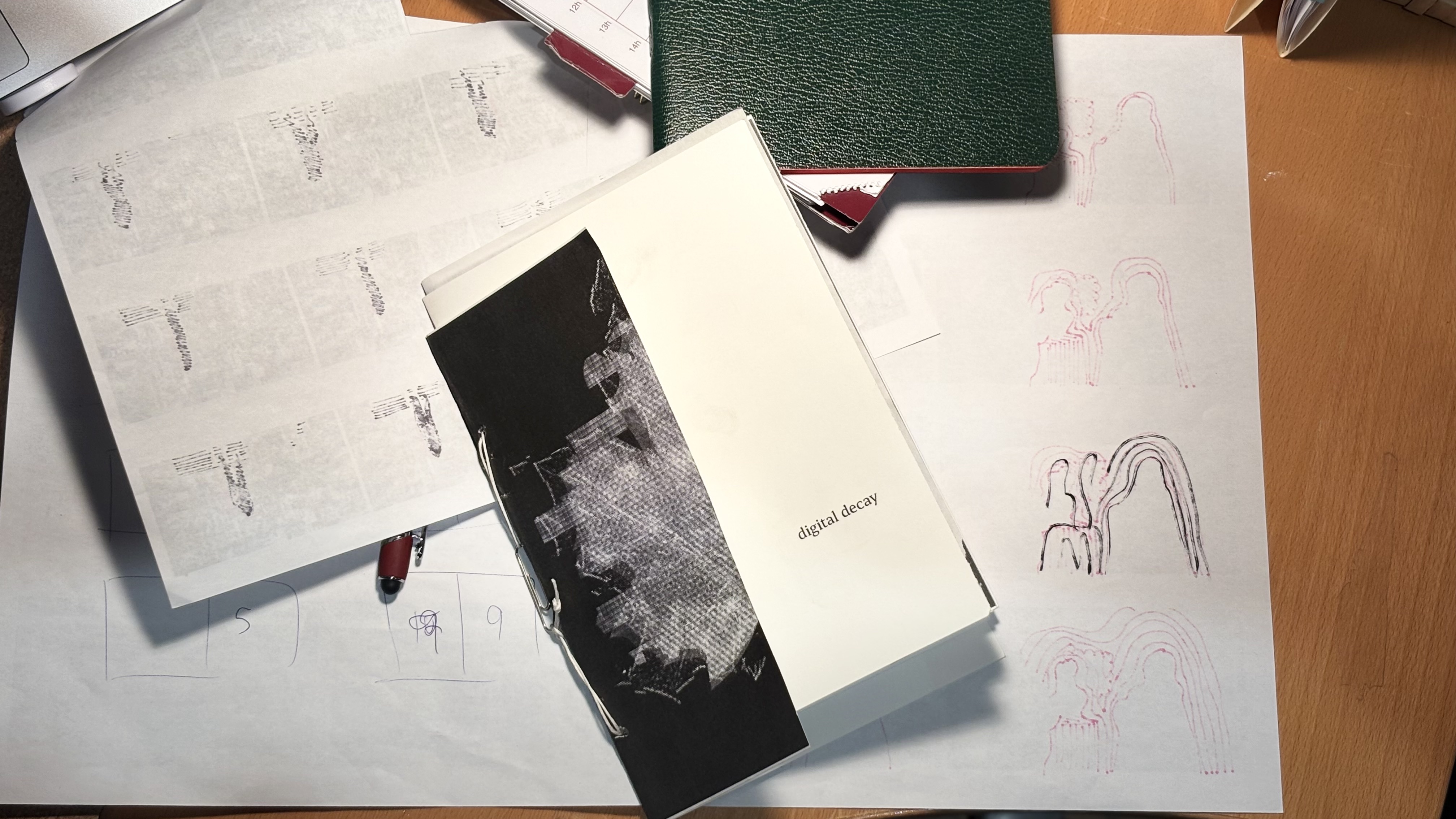
My visual direction for Digital Decay was heavily inspired by the grunge aesthetic of David Carson. I was drawn to his use of chaotic layouts, halftones, layering, and distortion effects. I also explored risograph printing during my research. I was fascinated by how the layered colors, ink textures, and imperfect registration added a raw, emotional quality to the visuals.
Throughout my process, I received valuable input from my teachers that helped push the concept forward. Peter suggested that the zine itself could physically deteriorate in the reader’s hands, a literal metaphor for the digital decay I was trying to express. Barry built on that by proposing that the images in the zine could be constructed from binary code, and that the pages could be laser cut so that more and more of the imagery gets physically cut out as the zine progresses. Although the laser cutting tests didn’t work out, a moment of inspiration came when Barry showed an acetate sheet to another student.
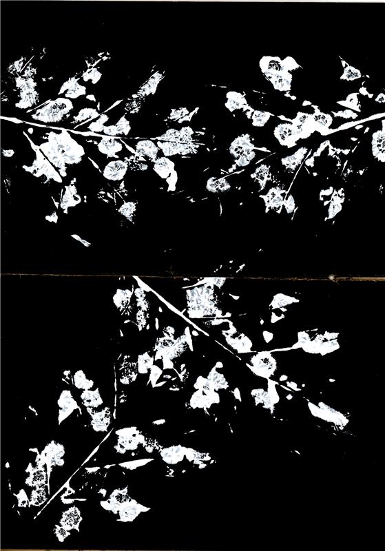
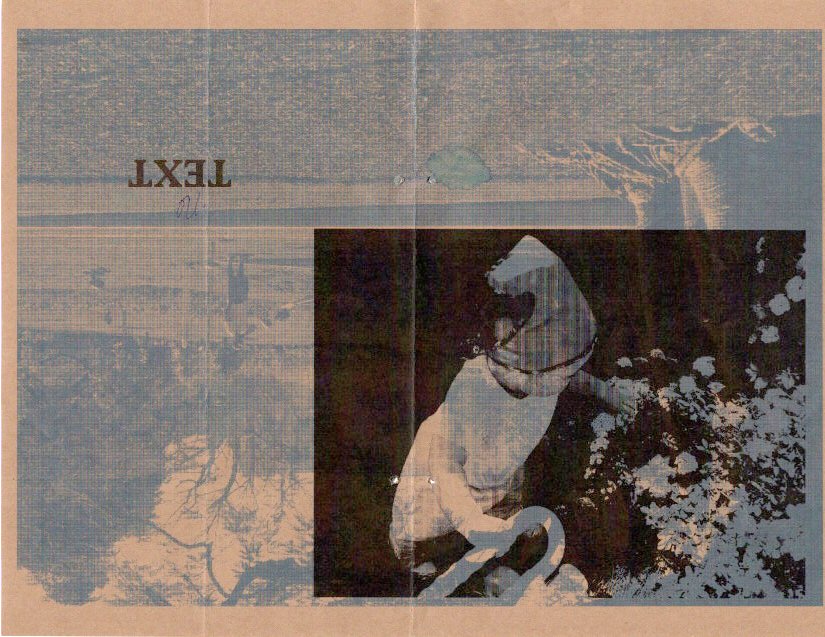
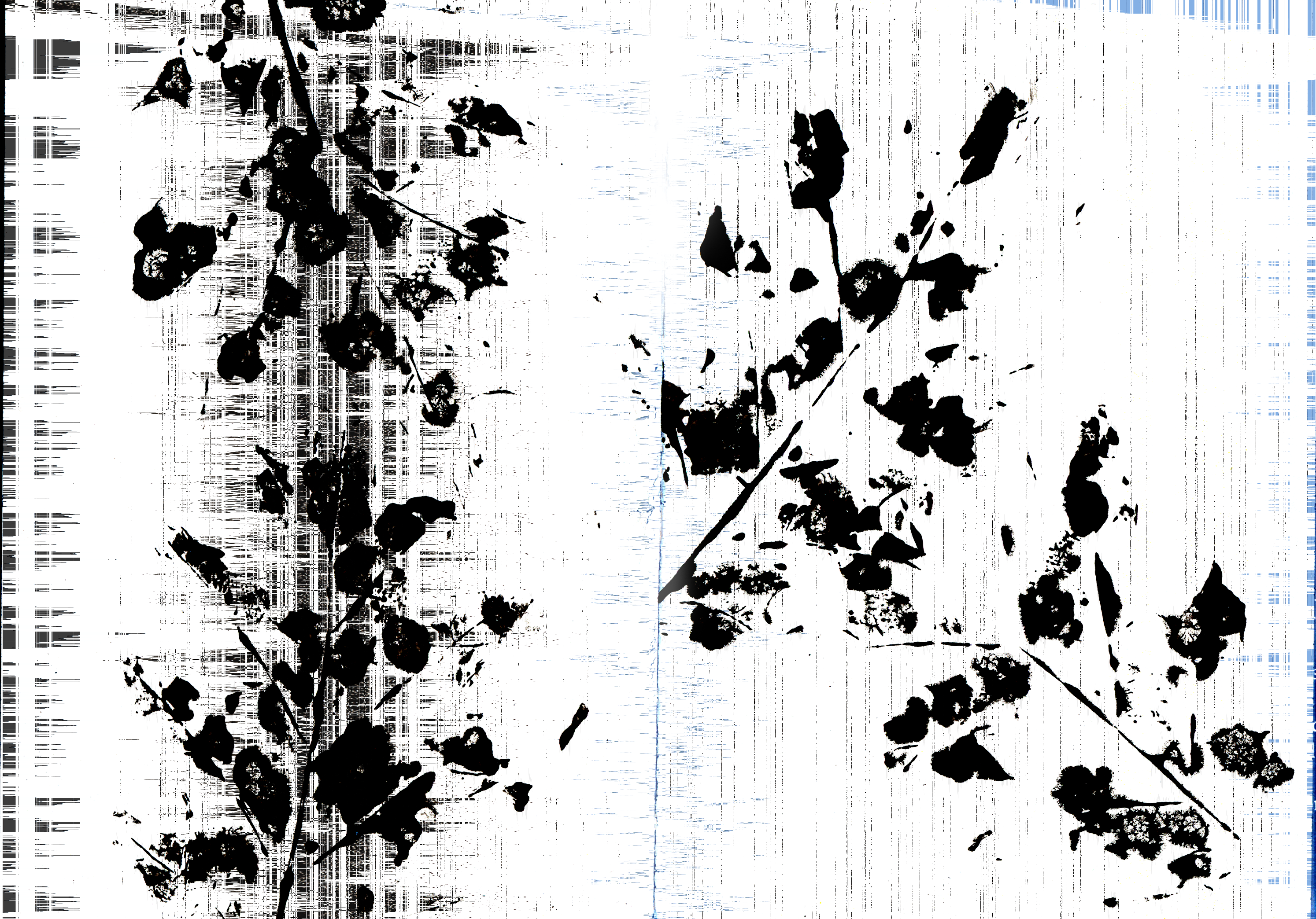
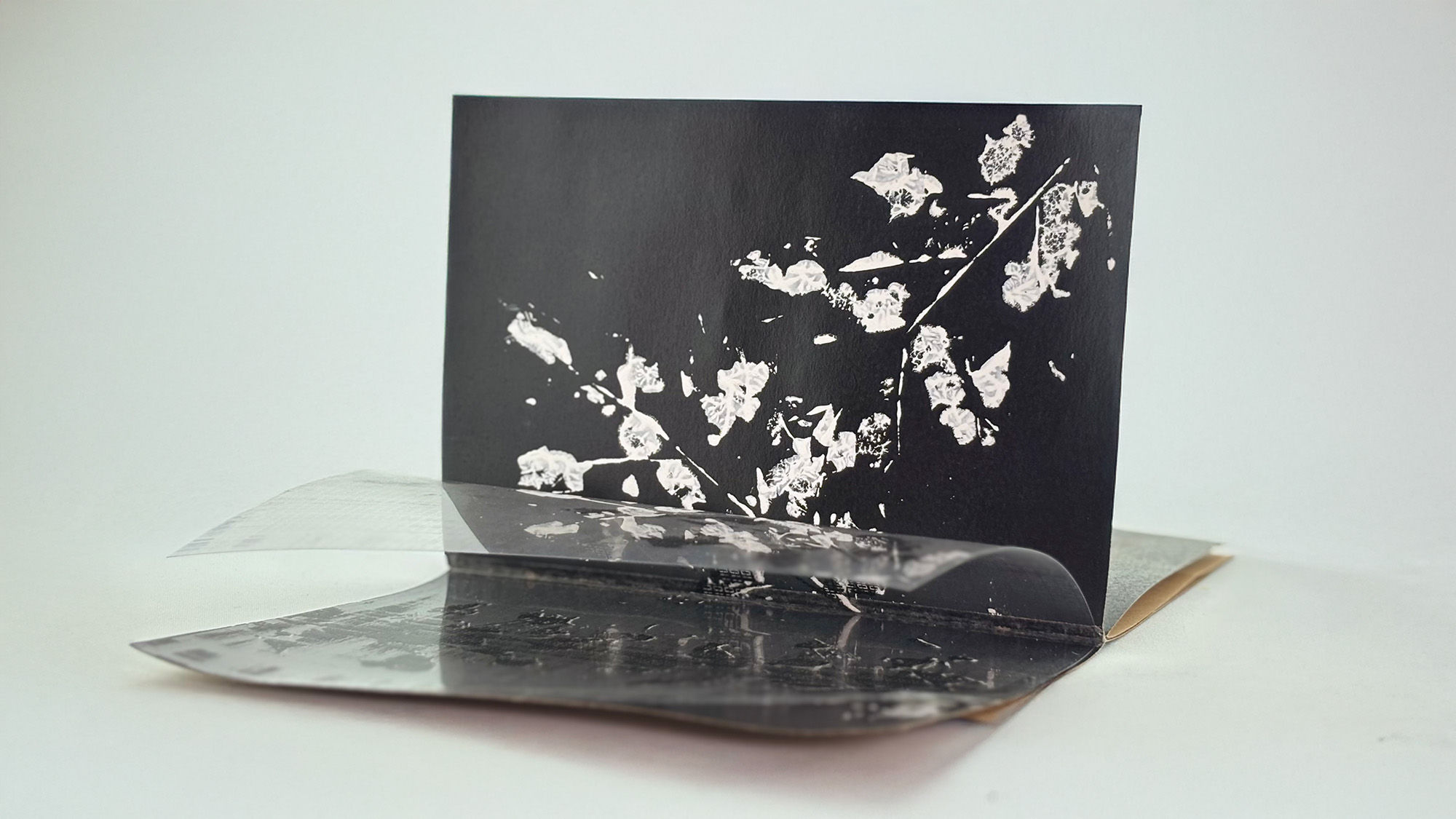
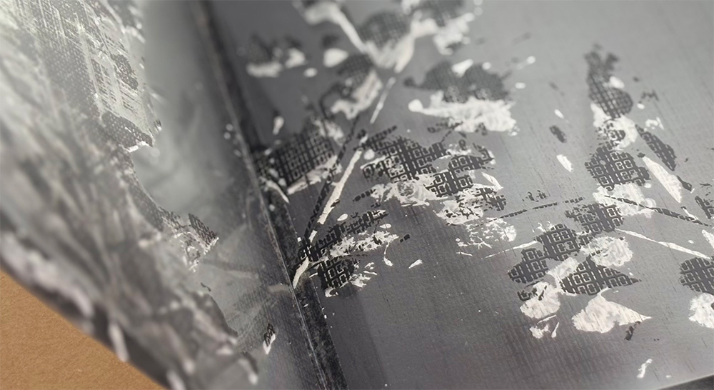
To visually communicate the theme of disconnection, I incorporated an acetate sheet as a transparent overlay in the zine, symbolizing the blurred line between the natural and digital worlds. On one of the pages, I painted white paint directly onto real leaves and stamped them onto the page.

After scanning the painted leaves, I manipulated the images in Photoshop by distorting them and converting the leaf textures into binary code made up of 1s and 0s. This transformation reflected the digital erosion of natural elements, reinforcing the project’s core concept.
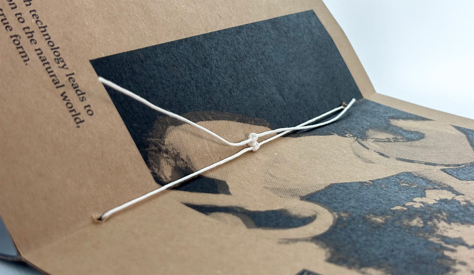
For the binding, I used a simple yet raw method by punching two holes and threading bookbinding string. This technique added to the tactile, handmade feel of the zine and complemented its grungy, experimental aesthetic. The exposed string binding gave the zine a vulnerable, unfinished look, aligning with the idea of gradual deterioration and imperfection.
Digital Decay is a meaningful personal project that represents both my design aesthetic and my values as a creative. Through this zine, I was able to explore the tension between digital and physical worlds and express a deeply personal reminder to myself to disconnect from screens and reconnect with reality.